Case study
Dolomiten Joghurt


BRIEF
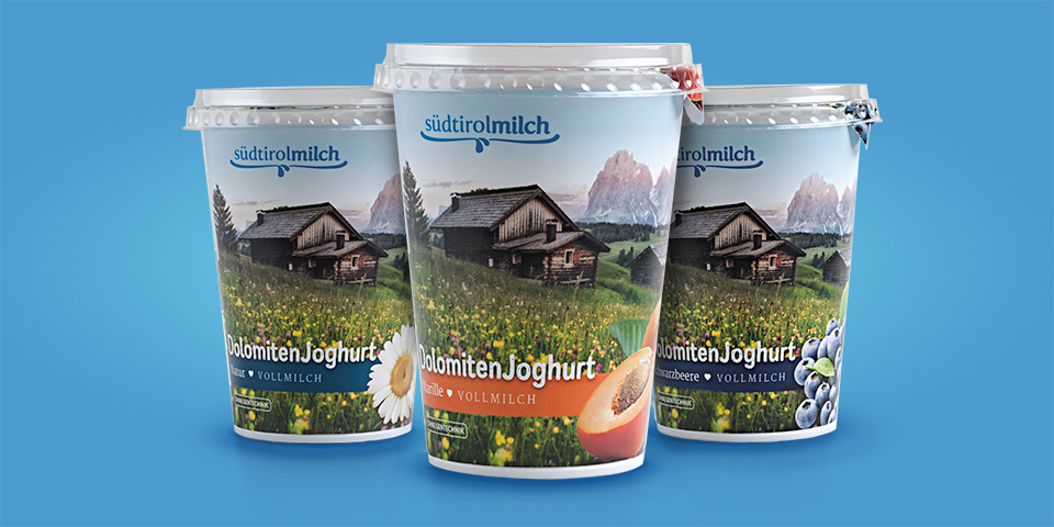
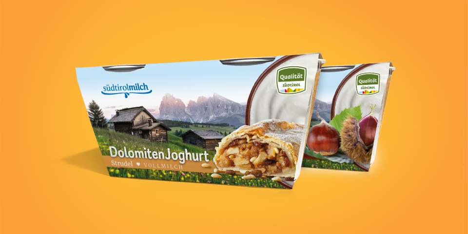
The company, a renowned Italian milk company based in the Dolomites, wanted to add a line of genuine, fresh yogurt for the German market, in two different sizes: the 2×125 g vase-cluster and the 400 mg jar.
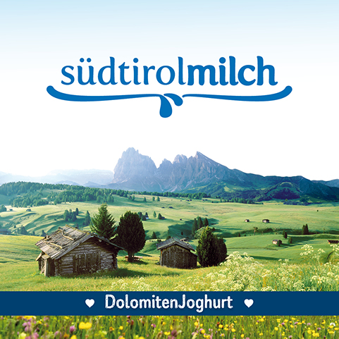
The new line needed an original visual identity that could recall both the magnificent landscapes of the Dolomites valleys where the animals are bred and the dairies are produced, and the naturalness of the ingredients.
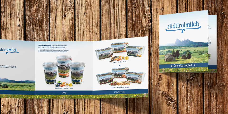
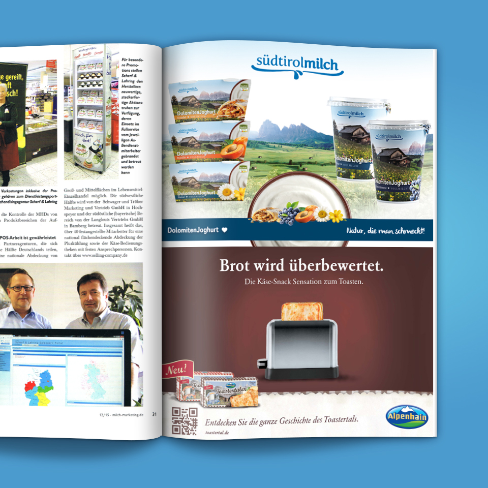
Along with the packages visual, we were asked to design the logo dedicated to the line naming, as well as an adv page and a displaying leaflet.

Solutions
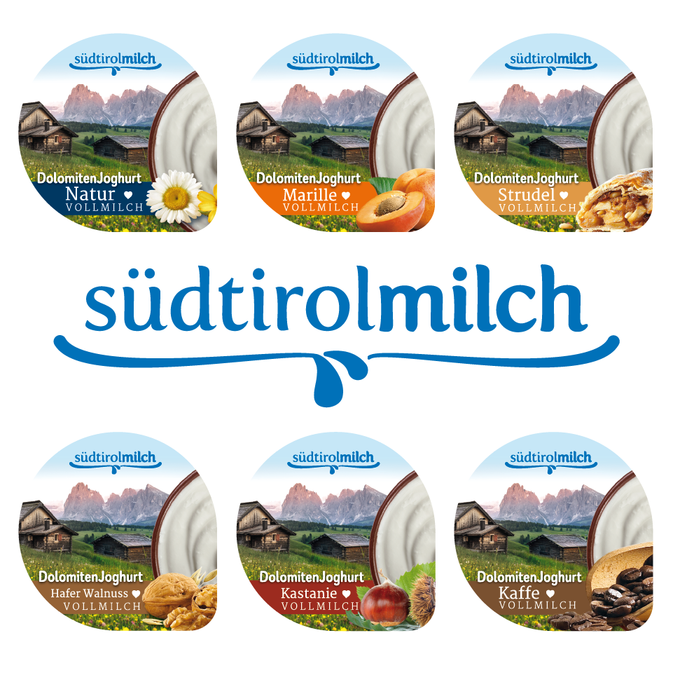
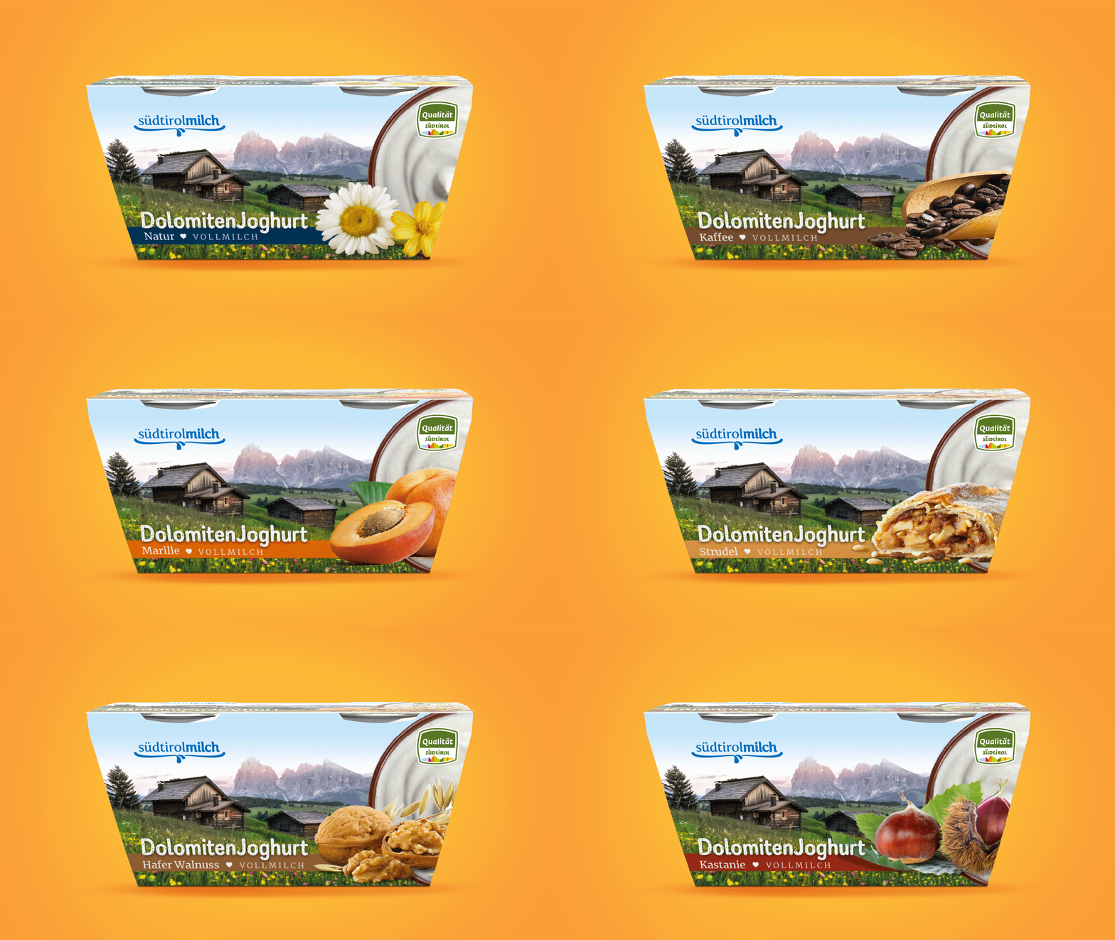
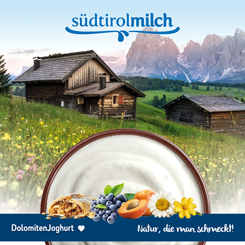
The identity we designed conveys the idea of a fresh, genuine, farm-made product. The main visual is always composed by a Dolomites landscape in the background and a big, clean picture of the ingredients placed in the foreground and always supported by the yogurt jar photograph.
The imagery takes the customer straight to a Dolomites valley, where he can taste the genuine, natural yogurt the farmer has freshly made.

